Visual Identity System
From Massdrop to Drop
Founded in 2012, Drop (formerly Massdrop) pioneered a revolutionary approach to e-commerce by creating a product design-focused "mass-buying" commerce platform. The company's mission centered on fostering close collaboration with passionate enthusiasts, connecting communities around shared interests in premium, design-forward products.
In Spring 2019, I led Drop's dedicated creative team to a comprehensive brand transformation, evolving from Massdrop to Drop. This strategic rebrand reflected the company's maturation and commitment to streamlined, design-centric user experiences while maintaining its community-driven foundation.
Read more about the redesign below
01
The centerpiece of Drop's new identity is a custom wordmark, meticulously crafted to authentically represent Drop's unique character and community-focused approach. Designed for maximum versatility, the wordmark serves as the universal brand emblem and is typically presented in black or white to ensure optimal performance across all applications.
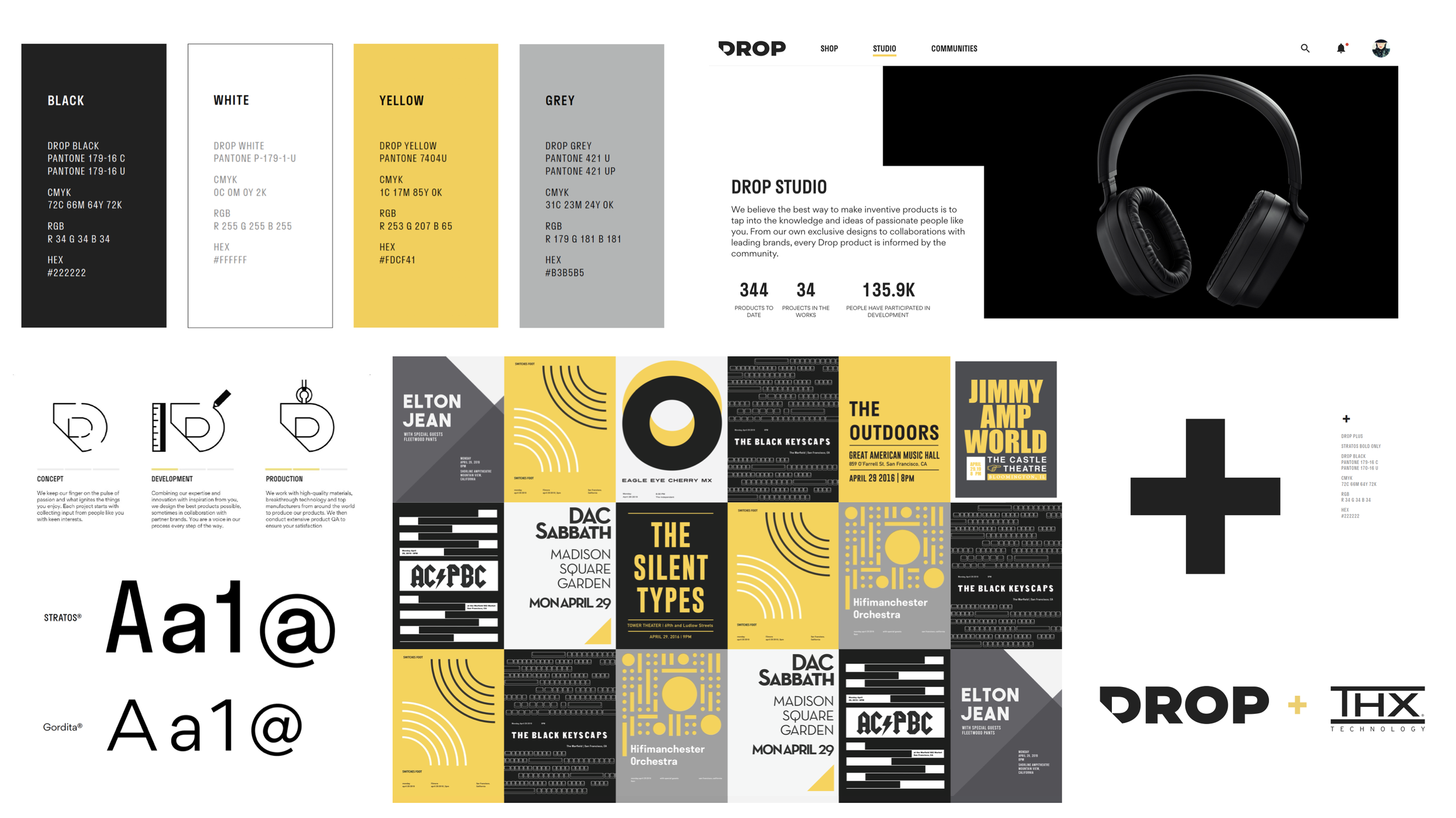
Color Philosophy
Drop's color system emerged from extensive research, including detailed analysis of Fortune 500 companies and insights drawn from Johann Wolfgang von Goethe's color theory. The primary color palette—black and white—and yellow as an accent color to provide strategic vibrancy and emphasis, represents a dramatic evolution from the previous teal branding to a sophisticated, minimalist approach. This simplified system creates cohesion and design intent while allowing products and content to take center stage.
Typography System
The brand employs a carefully curated two-tier typography system. Stratos (Production Type foundry) - is used consistently across all marketing and advertising materials for its distinctive character with the secondary typeface, Gordita (The Designers Foundry) - selected for functional applications and extended long-form text due to its exceptional readability.
03
02
Partnership Framework
Drop's collaborative model extends beyond individual products to encompass strategic partnerships with respected industry brands and visionary designers. To reinforce these relationships and create structural clarity, a distinctive symbol system was developed to represent:
Brand Partnerships: Collaborations with established companies
Designer Partnerships: Direct collaboration with individual creators
This unified naming and visual structure emphasizes the significance of these partnerships while maintaining brand consistency across all collaborative efforts.
Brand Impact
The comprehensive rebrand successfully positioned Drop as a mature, design-conscious platform that bridges the gap between passionate communities and exceptional products. The refined visual language supports the company's unique position in the enthusiast commerce market while maintaining the collaborative spirit that defines its core mission.

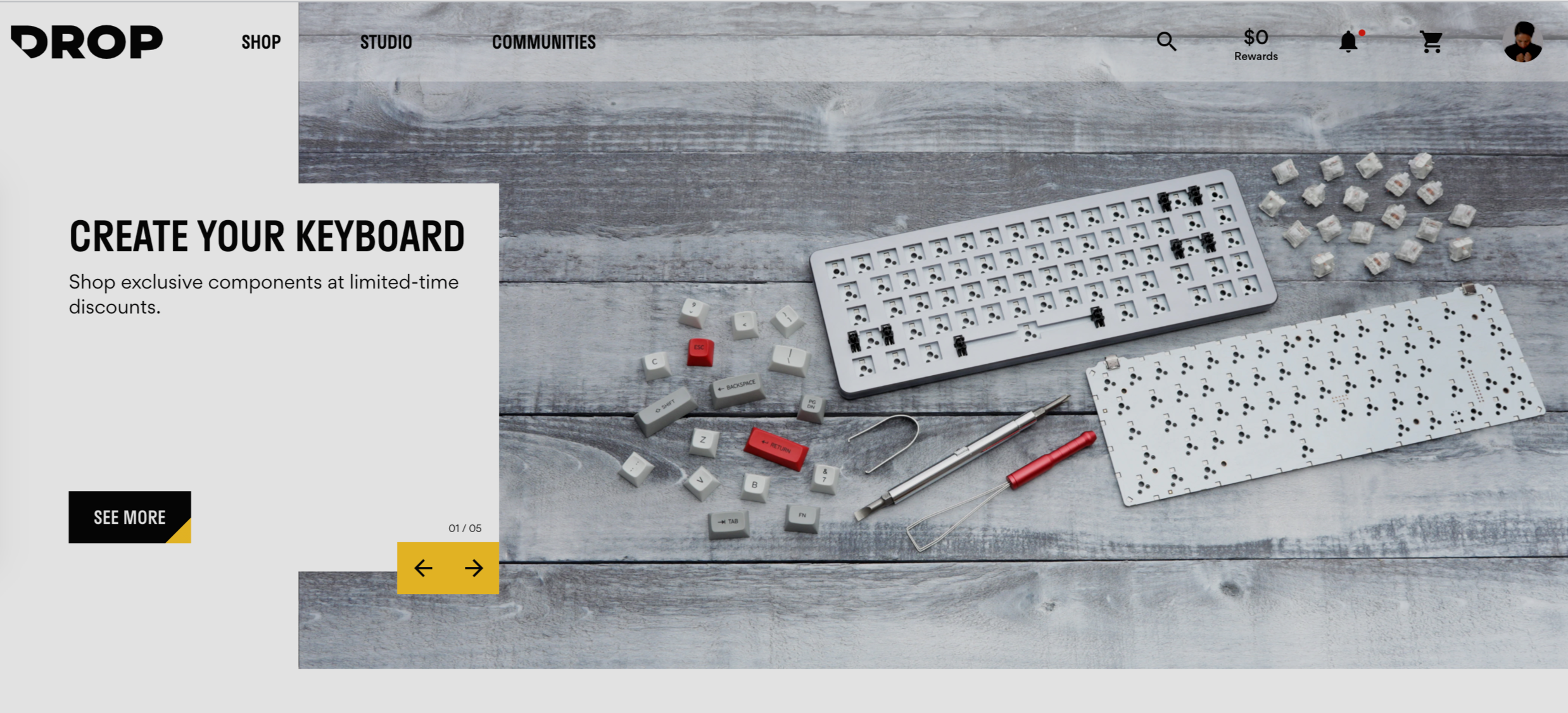
Digital Experience > Shop
Provenance of Product(s)
An advocate of Bauhaus and Swiss Design, I collaborated with Stink Studios (Los Angeles, CA) to develop a refined CX Design that enabled seamless and intuitive navigation for users to effortlessly ‘Shop’ for custom-made products, discover and learn about Drop’s specialized industrial design arm (Drop Studio), or actively engage with like-minded individuals within the vibrant ‘Community.’ The homepage prominently features striking product photography, a generous breakout of expansive white space, and a minimalistic use of color strategically applied to CTAs to guide user interaction.
Visit drop.com to explore and experience more in detail.
04
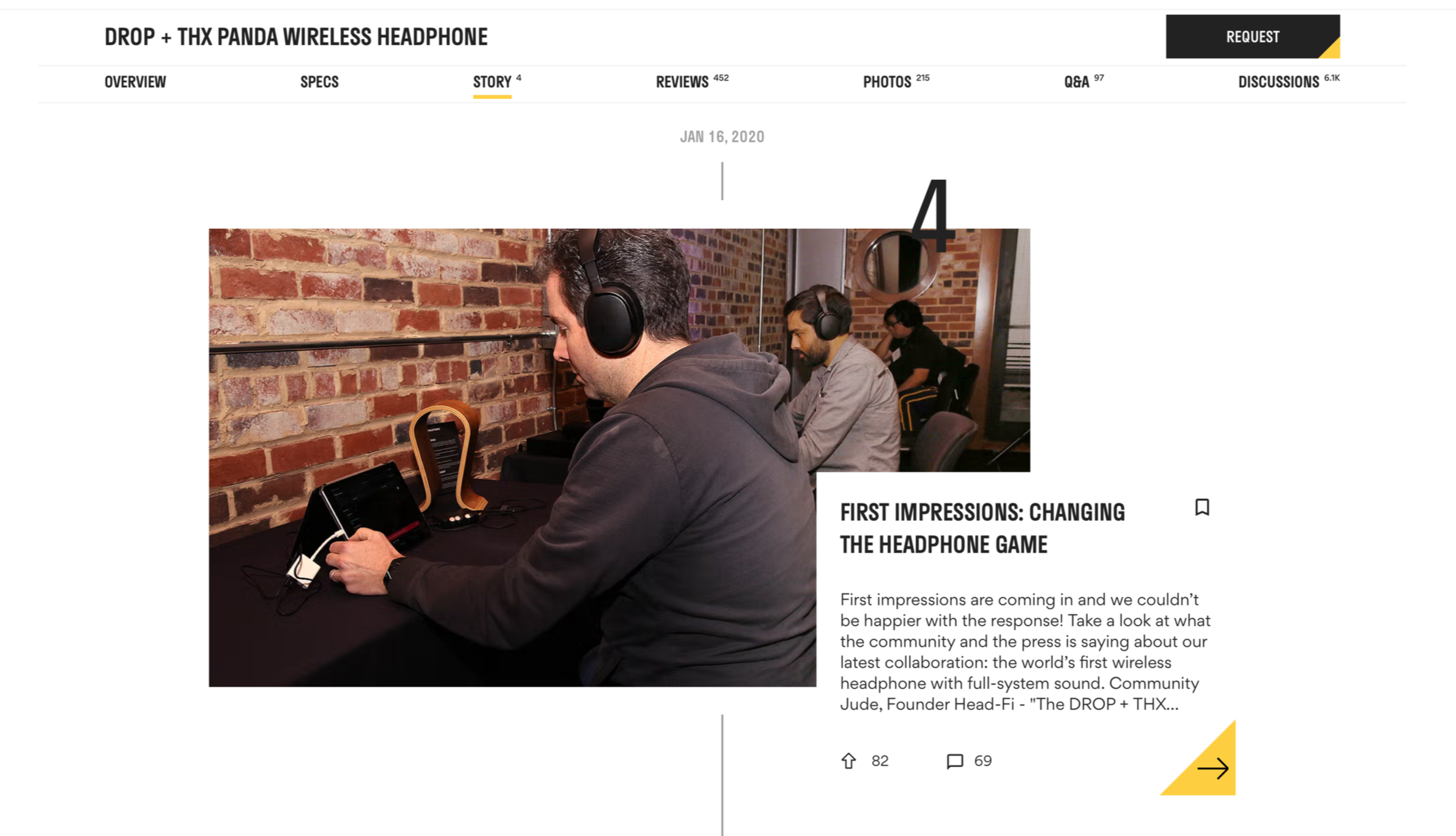
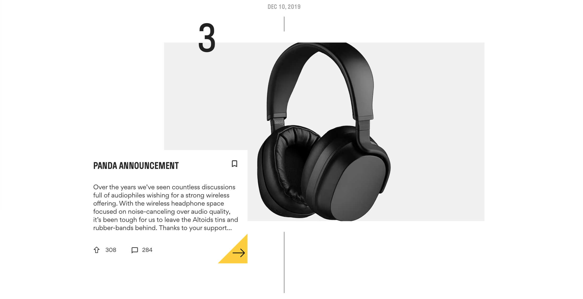
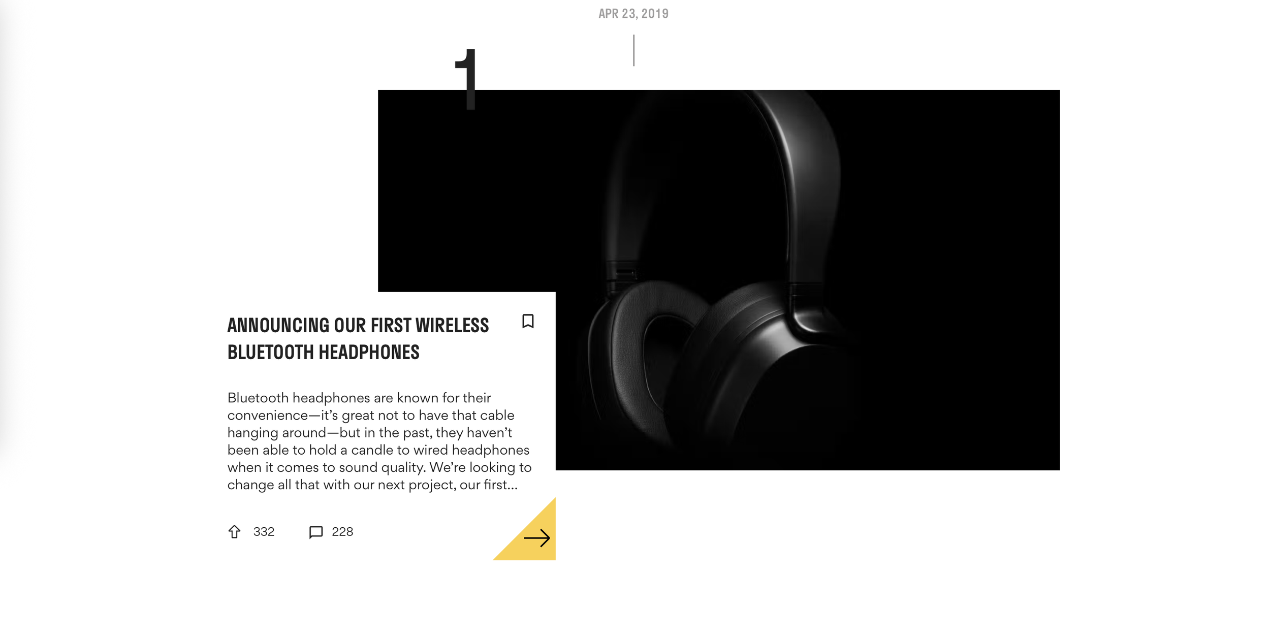
To create a story that goes above and beyond the traditional PDP (Product Detail Page), I wanted users to gain a deeper understanding of the provenance of each product. A chronological design mapped out the stages of manufacturing, from the initial concepts of our in-house industrial designers at Drop Studio, we provided content that included initial ideation and community collaboration. We leveraged our community for user-generated content across social media platforms and other owned marketing channels to maximize engagement and garner interest for a listening party in San Francisco, CA.
This is an example of a detailed and comprehensive five-part product design process specifically developed for Drop and THX Technology. To gain a deeper understanding of the product and its unique features, watch the accompanying film here.