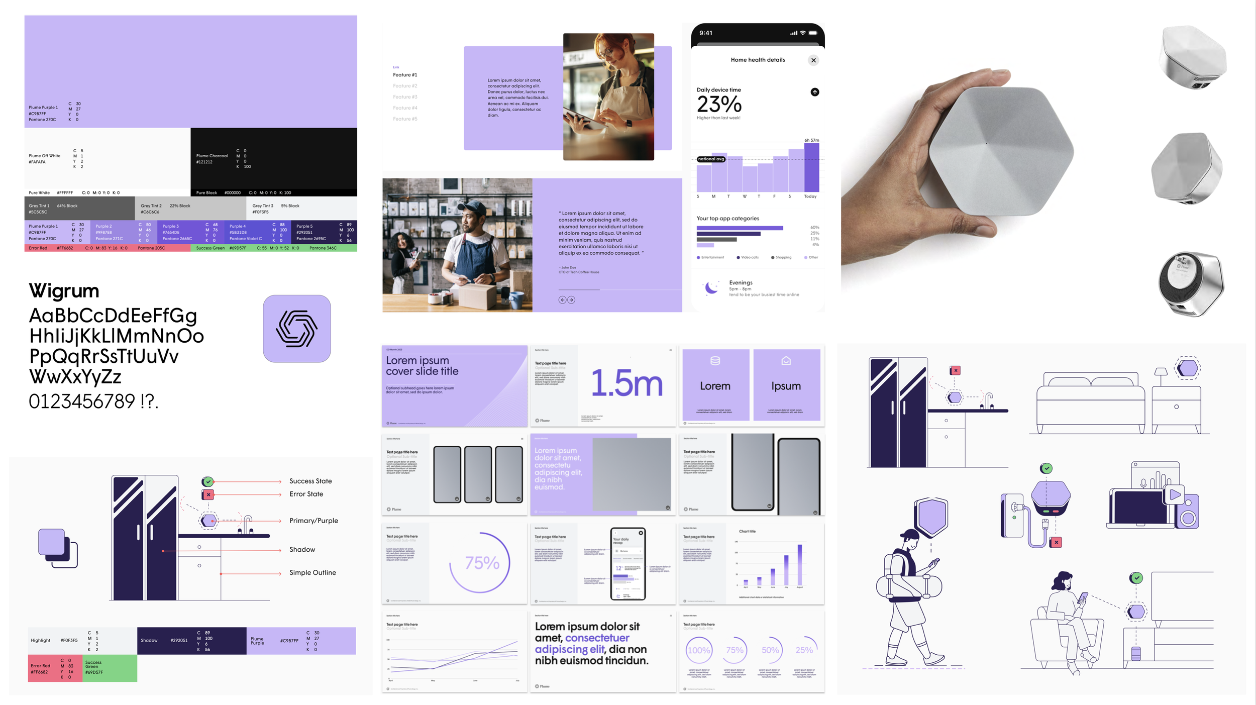
A refined, clean design system
Birds of a feather…
Since its founding in 2015, Plume operated as a B2B company with multiple sub-brands, each targeting distinct audiences with separate product lines. This approach resulted in a fragmented brand portfolio where each sub-brand developed its own visual identity and design language, creating inconsistency across the overall brand experience.
By 2023, Plume's brand landscape had become complex and disjointed. Multiple design languages coexisted without cohesion, diluting brand recognition and creating confusion in the marketplace. The diverse visual approaches, while serving individual product needs, lacked the unified strength that comes from a cohesive brand system.
Read more about the redesign below
01
In 2023, I initiated a comprehensive brand audit to address challenges related to a disjointed design language. Rather than pursuing a complete rebrand, the project focused on analyzing existing brand elements across all sub-brands, identifying design inconsistencies and opportunities for alignment, preserving brand equity while introducing fresh, contemporary elements, and creating synergy between disparate visual languages.
Enhanced Visual Cohesion: A harmonized design system that connects all sub-brands
Contemporary Aesthetic: A lighter, more modern visual language that reflects current design trends
Strategic Continuity: Preservation of brand recognition and equity built over eight years
Operational Efficiency: Streamlined brand guidelines that support consistent implementation across all touchpoints
The brand evolution resulted in a refined, unified approach that positioned Plume with a more sophisticated and unified brand presence while respecting its established market position and diverse product portfolio.
02
02a
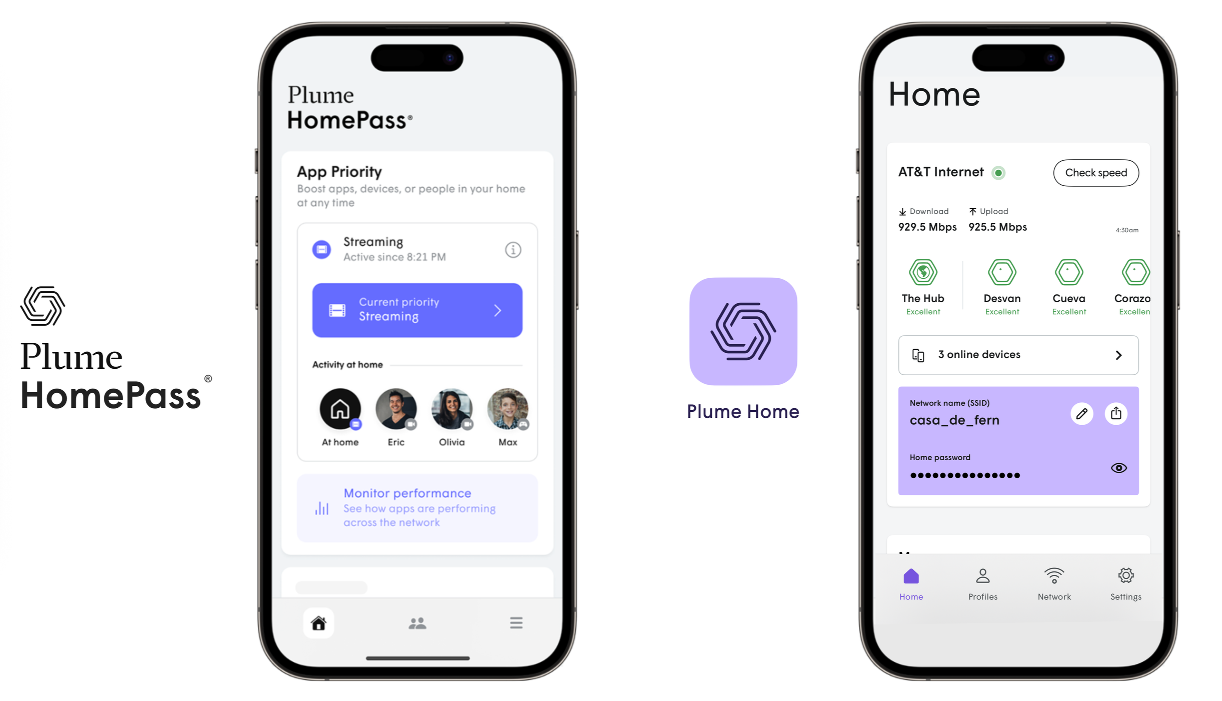
Plume Home Mobile Application Rebrand
Focused on emotional minimalism, the refined brand direction positions Plume Home as a modern, smart home platform while maintaining the technical sophistication required for B2B ISP partnerships, making complex technology feel approachable and intuitive.
In 2025, I led a comprehensive rebrand of Plume’s WiFi mobile application, transitioning from HomePass® to Plume Home™ to deliver a modernized and refreshed user experience that aligns with the company's evolving brand identity and dual-audience strategy.
The rebrand was led as a holistic transformation that encompassed not only the application's visual identity but also the broader ecosystem of sales and marketing materials that scale across multiple touchpoints and audiences.
This initiative involved the comprehensive revamp of over 40 sales and marketing assets, including:
Mobile app screens and user interface elements
Brand logos and visual identity systems
Lifestyle imagery and photography
Product demonstration videos
Marketing collateral and sales enablement tool
02b
An example of a Sales Enablement tool demonstrating both light and dark modes for ISP (Internet Service Providers/B2B) channel marketing assets, providing versatile options for various branding and presentation needs.